Admin Dashboard

Admin Dashboard

Project

PestBoss

Breakdown

UI/UX

User Research

Admin Dashboard

Project

PestBoss

Breakdown

UI/UX

User Research

Empowering Admins with Insightful Customer Analytics

The Problem

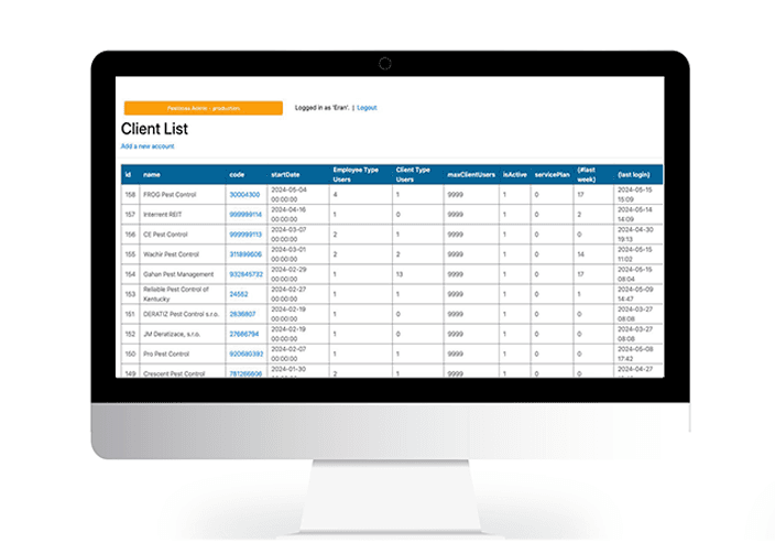
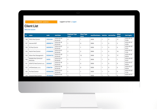
The current PestBoss admin dashboard addresses the challenge of limited control over customer insights. Admins face issues with visibility into their customer base, inability to filter data by KPIs, and a lack of real-time updates on account activity, renewals, and expirations. Additionally, categorization of users by type and geographic data is inadequate, complicating understanding of customer diversity and distribution.

Existing System

The Insights

Pros

Intuitive navigation system facilitates easy access to various financial tools and features.

Prioritize Customizable Data Visibility with User Centric Design

Allow administrators to personalize their data views through drag-and-drop widgets or customizable dash lets.

Provide a seamless experience with intuitive data organization and filtering options, ensuring that users can easily configure the dashboard to align with their unique KPIs and workflow preferences.

The Insights

Prioritize Customizable Data Visibility with User
Centric Design

Allow administrators to personalize their data views through drag-and-drop widgets or customizable dash lets.

Provide a seamless experience with intuitive data organization and filtering options, ensuring that users can easily configure the dashboard to align with their unique KPIs and workflow preferences.
The Benchmark

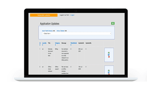
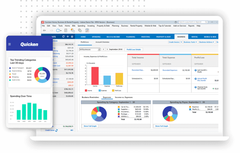
QUICKEN- a Personal Finance and Money Management Software.

Quicken's dashboard offers intuitive navigation and insightful visualizations, providing users with easy access to financial tools and a snapshot of their financial health. However, its overwhelming interface and limited customization options pose challenges for users seeking personalized experiences.

Pros

Comprehensive visualizations offer insights into users' financial health at a glance.

Cons

Overwhelming amount of information presented on a single screen may lead to user confusion or cognitive overload.

Cons

Lack of customization options limits users' ability to tailor the dashboard to their specific needs and preferences.

The Benchmark
QUICKEN- a Personal Finance and Money Management Software.
Quicken's dashboard offers intuitive navigation and insightful visualizations, providing users with easy access to financial tools and a snapshot of their financial health. However, its overwhelming interface and limited customization options pose challenges for users seeking personalized experiences.

Pros

Intuitive navigation system facilitates easy access to various financial tools and features.

Pros

Comprehensive visualizations offer insights into users' financial health at a glance.

Pros

Comprehensive visualizations offer insights into users' financial health at a glance.

Cons

Overwhelming amount of information presented on a single screen may lead to user confusion or cognitive overload.

Cons

Lack of customization options limits users' ability to tailor the dashboard to their specific needs and preferences.

User Research

During my user research, I conducted interviews with the director and co-founder of Pestboss, who serve as the primary users of the dashboard. They shared insights into their experiences with the current dashboard, as well as their needs and pain points.

Cons

Lack of customization options limits users' ability to tailor the dashboard to their specific needs and preferences.

The User Research

During my user research, I conducted interviews with the director and co-founder of PestBoss, who serve as the primary users of the dashboard. They shared insights into their experiences with the current dashboard, as well as their needs and pain points.

Enhancing Insight Control

Users expressed frustration with the lack of visibility into customer data, hindering their ability to make informed decisions.

Limited KPI filtering

The dashboard doesn't allow filtering by KPI, hindering administrators' ability to track crucial metrics for decision-making.

Lack of real-time updates on account activity

Users found it challenging to stay updated on account activity, renewals, and expirations, impacting their understanding of critical customer interactions and engagement levels.

The Persona

Name: Oliver Williams

Occupation: Director & Ceo
Location: Vancouver, Canada

Meet Oliver: a CEO managing multiple companies. Efficiency is key as he values time and resources. Outside work, he enjoys family time, travel, and sunny days, finding balance in his busy life. Steve prioritizes solutions optimizing operations and allowing him to pursue his passions.

Disorganized Coordination

Coordinating grooming, outdoor activities & training across many platforms becomes complex, leading to scheduling inefficiencies for owners managing their pet's experience.

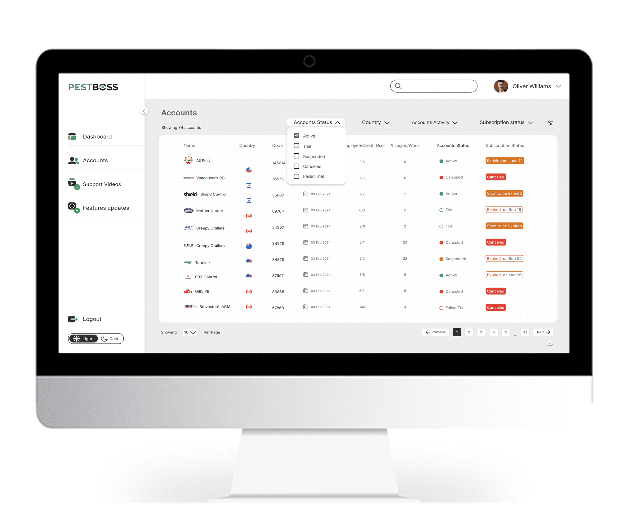
The Accounts Activity Dashboard
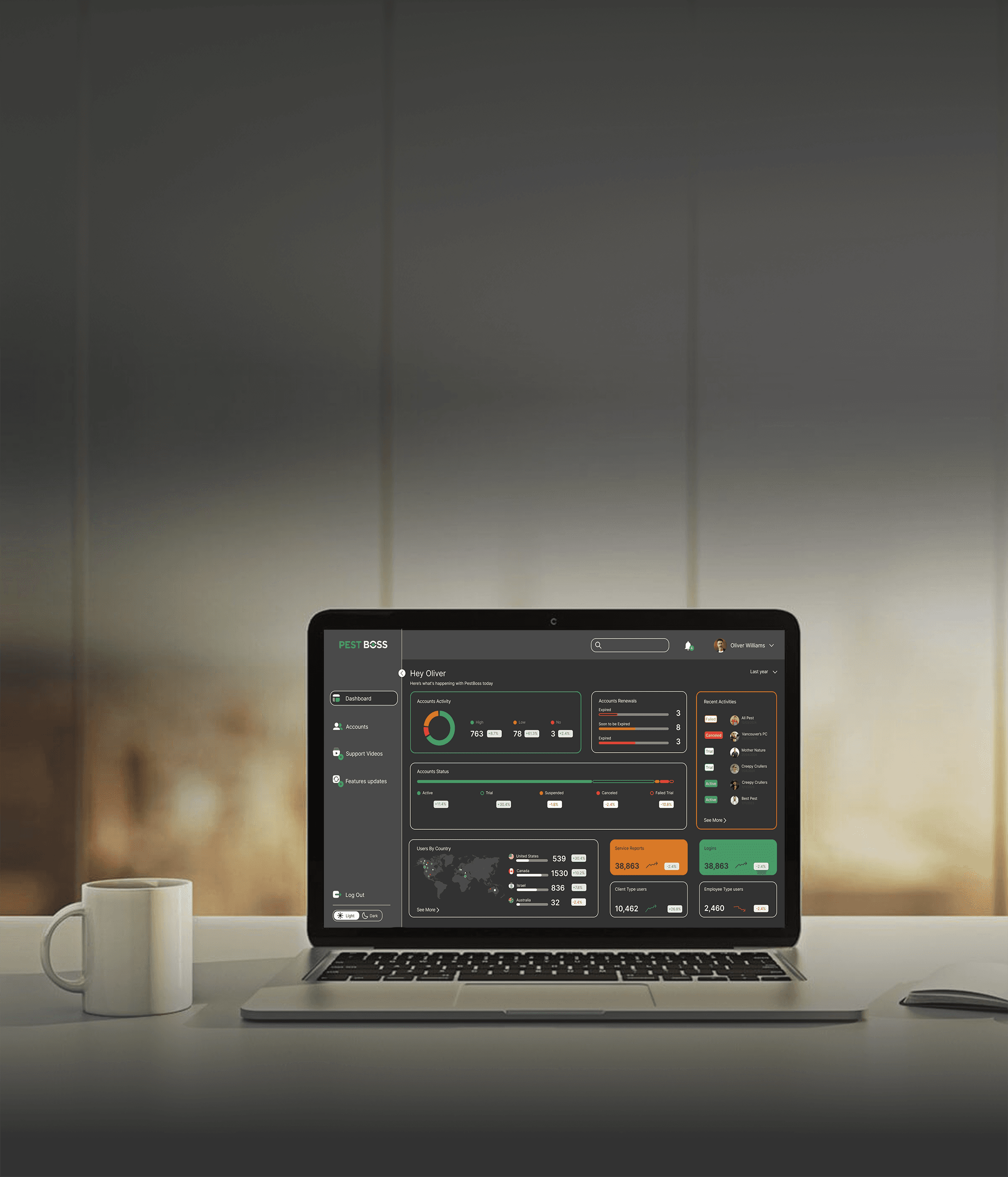
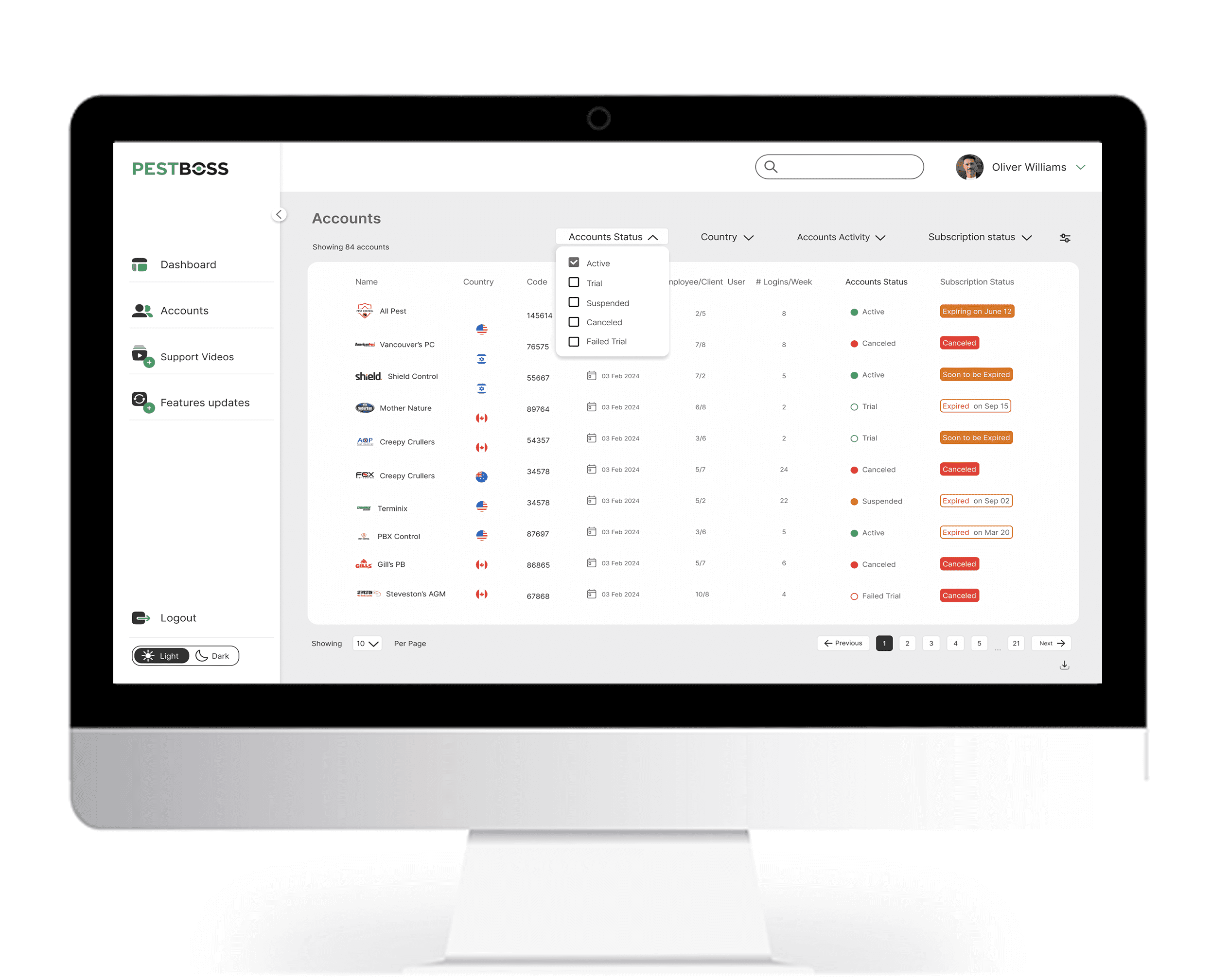
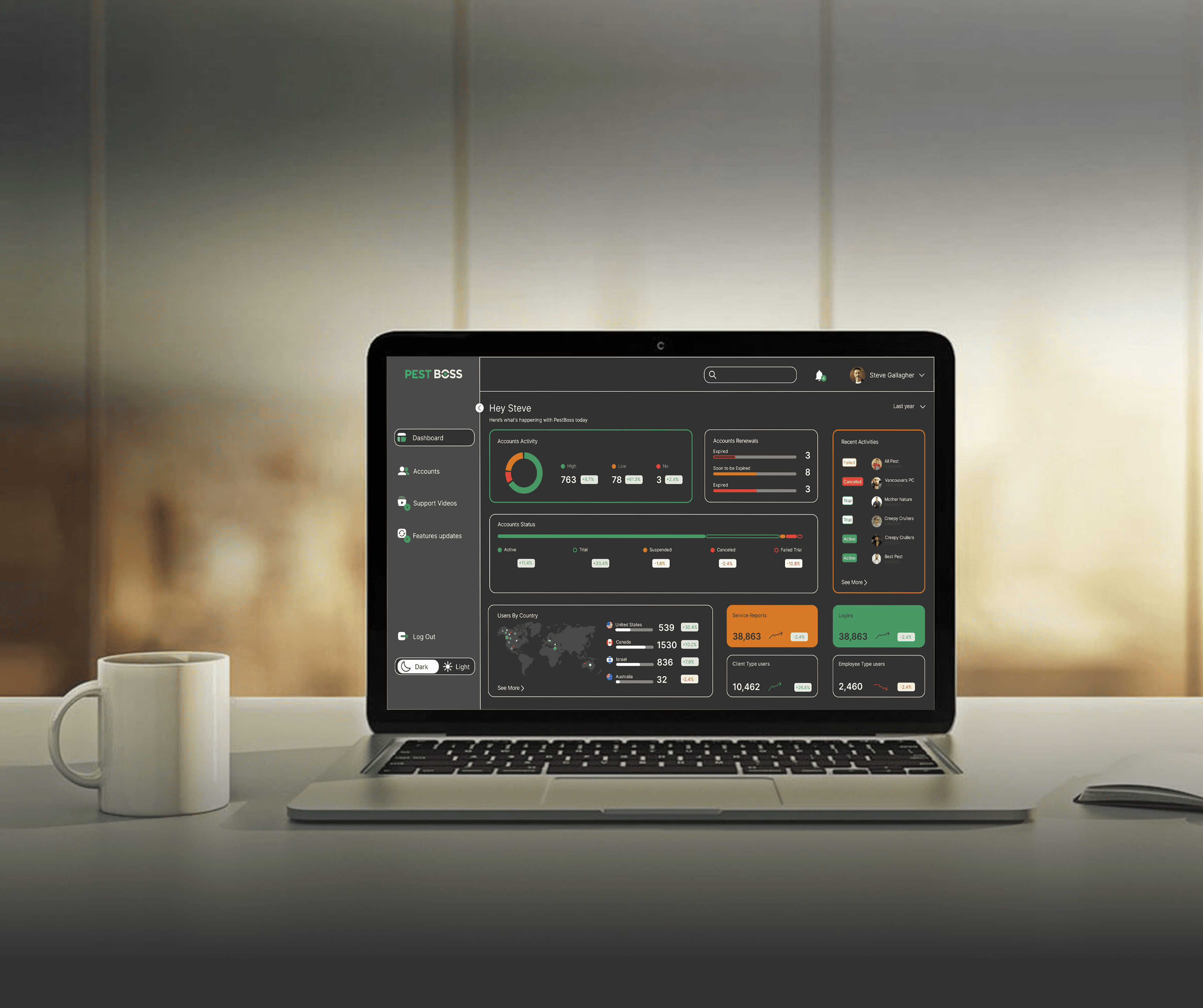
Layout and Structure: Clean, organized layout with a clear hierarchy.
Functionality: Account filtering options (Status, Country, Activity, Subscription status).
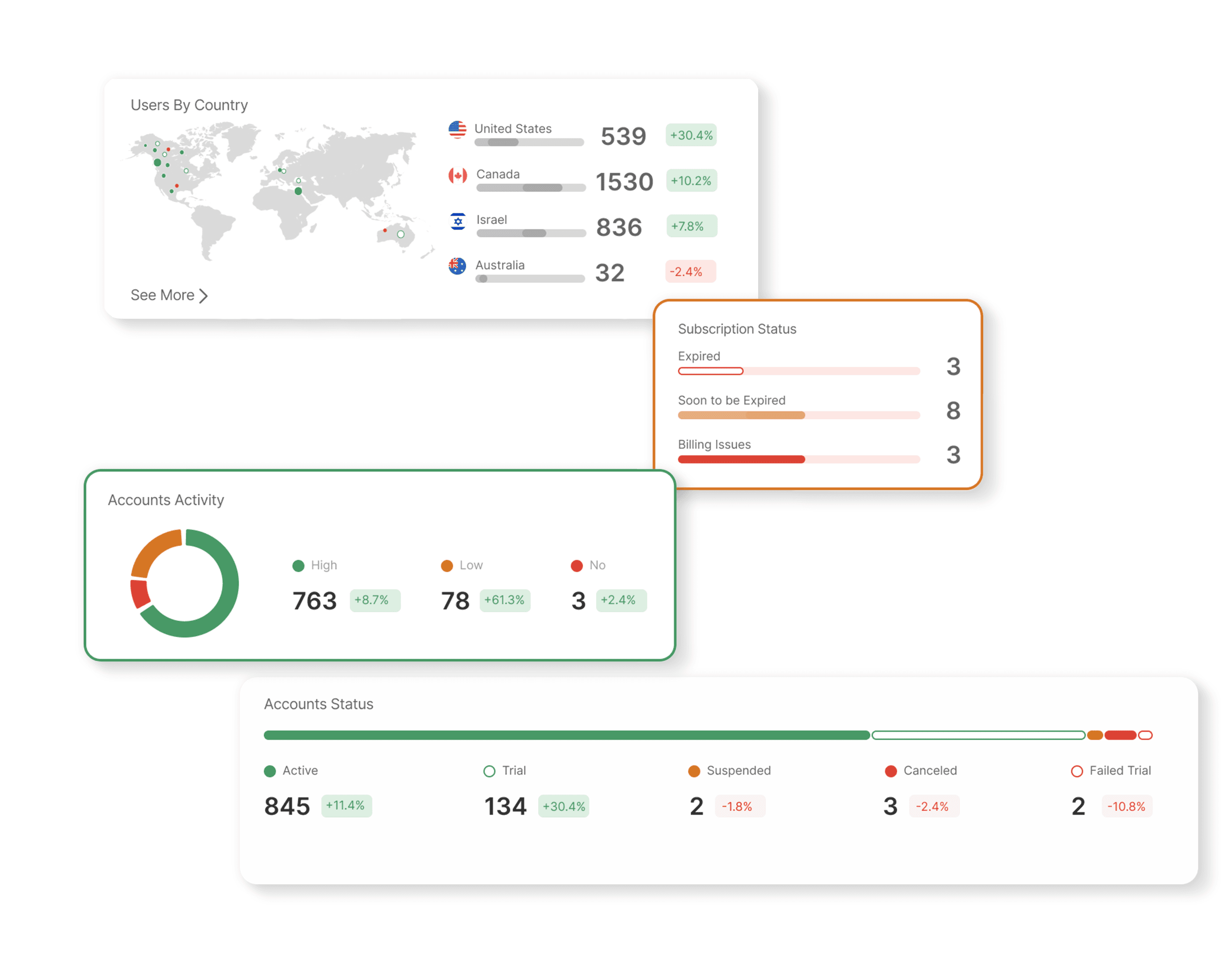
Data Visualization: Effective use of icons, Clear presentation of key account metrics, Status indicators use both color and text for clarity.

The Main Dashboard
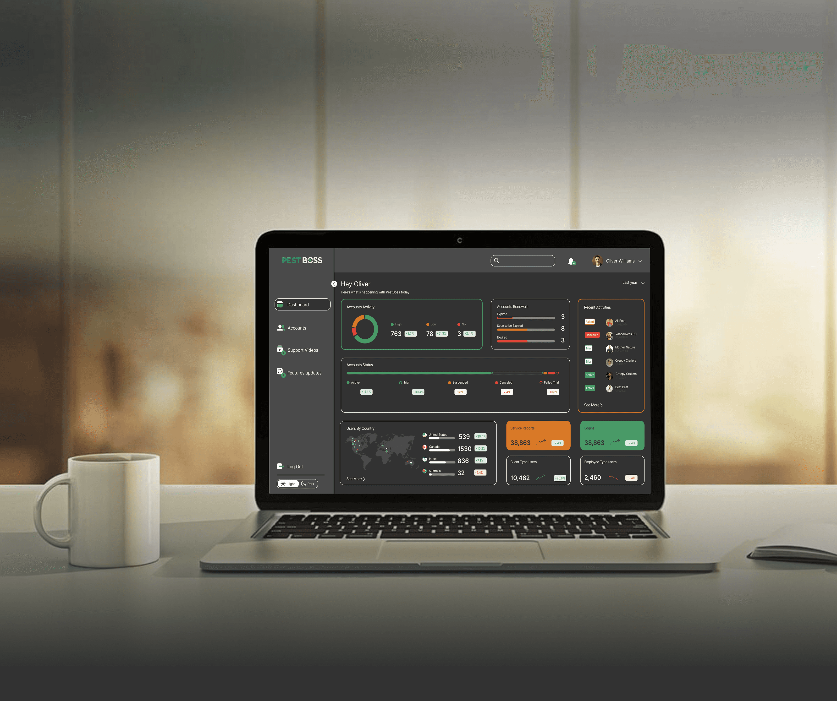
Clear Hierarchy: Information flows logically, ensuring easy navigation.
Color Coding: Green for positive and red for negative insights enhance data comprehension.
Intuitive Navigation: Sidebar menu simplifies access to different sections.
Dark/Light Mode Toggle: Offers users a personalized viewing experience.
Geographical Insights: World map visualizes user distribution by country.

Visual and Interaction Design

User-Friendly Navigation: Easy access to main sections.

Visual Hierarchy: Clear prioritization of information.

Color Coding: Immediate understanding of statuses and actions.

Responsive Design: Ensures usability across devices.

Thank you

The Accounts Activity Dashboard
Layout and Structure: Clean, organized layout with a clear hierarchy.
Functionality: Account filtering options (Status, Country, Activity, Subscription status).
Data Visualization: Effective use of icons, Clear presentation of key account metrics, Status indicators use both color and text for clarity.


" I invest too much precious time gathering information and monitoring account statuses. "

The solution

The solution

This redesign of the PestBoss Admin Dashboard aims to provide a powerful, user-centric tool for administrators, addressing their pain points and enhancing their ability to manage customer data effectively.
By prioritizing customizable data visibility, intuitive filtering, real-time updates, and comprehensive user categorization, this solution will significantly improve operational efficiency and decision-making for users like Oliver Williams.

The Main Dashboard

Clear Hierarchy: Information flows logically, ensuring easy navigation.
Color Coding: Green for positive and red for negative insights enhance data comprehension.
Intuitive Navigation: Sidebar menu simplifies access to different sections.
Dark/Light Mode Toggle: Offers users a personalized viewing experience.
Geographical Insights: World map visualizes user distribution by country.


The Accounts Activity Dashboard

Layout and Structure: Clean, organized layout with a clear hierarchy.
Functionality: Account filtering options (Status, Country, Activity, Subscription status).
Data Visualization: Effective use of icons, Clear presentation of key account metrics, Status indicators use both color and text for clarity.


Visual and Interaction Design

User-Friendly Navigation: Easy access to main sections.

Visual Hierarchy: Clear prioritization of information.

Color Coding: Immediate understanding of statuses and actions.

Responsive Design: Ensures usability across devices.

" I invest too much precious time gathering information and monitoring account statuses. "

The solution

This redesign of the PestBoss Admin Dashboard aims to provide a powerful, user-centric tool for administrators, addressing their pain points and enhancing their ability to manage customer data effectively.
By prioritizing customizable data visibility, intuitive filtering, real-time updates, and comprehensive user categorization, this solution will significantly improve operational efficiency and decision-making for users like Oliver Williams.

The Main Dashboard

Clear Hierarchy: Information flows logically, ensuring easy navigation.
Color Coding: Green for positive and red for negative insights enhance data comprehension.
Intuitive Navigation: Sidebar menu simplifies access to different sections.
Dark/Light Mode Toggle: Offers users a personalized viewing experience.
Geographical Insights: World map visualizes user distribution by country.

.

The Main Dashboard

Clear Hierarchy: Information flows logically, ensuring easy navigation.
Color Coding: Green for positive and red for negative insights enhance data comprehension.
Intuitive Navigation: Sidebar menu simplifies access to different sections.
Dark/Light Mode Toggle: Offers users a personalized viewing experience.
Geographical Insights: World map visualizes user distribution by country.


Thank you

Visual and Interaction Design

User-Friendly Navigation: Easy access to main sections.

Visual Hierarchy: Clear prioritization of information.

Color Coding: Immediate understanding of statuses and actions.

Responsive Design: Ensures usability across devices.

Admin Dashboard

Admin Dashboard

Project

PestBoss

Breakdown

UI/UX

User Research

Admin Dashboard

Project

PestBoss

Breakdown

UI/UX

User Research

Empowering Admins with Insightful Customer Analytics

The Problem

The current PestBoss admin dashboard addresses the challenge of limited control over customer insights. Admins face issues with visibility into their customer base, inability to filter data by KPIs, and a lack of real-time updates on account activity, renewals, and expirations. Additionally, categorization of users by type and geographic data is inadequate, complicating understanding of customer diversity and distribution.

Existing System

The Insights

Pros

Intuitive navigation system facilitates easy access to various financial tools and features.

Prioritize Customizable Data Visibility with User Centric Design

Allow administrators to personalize their data views through drag-and-drop widgets or customizable dash lets.

Provide a seamless experience with intuitive data organization and filtering options, ensuring that users can easily configure the dashboard to align with their unique KPIs and workflow preferences.

The Insights

Prioritize Customizable Data Visibility with User
Centric Design

Allow administrators to personalize their data views through drag-and-drop widgets or customizable dash lets.

Provide a seamless experience with intuitive data organization and filtering options, ensuring that users can easily configure the dashboard to align with their unique KPIs and workflow preferences.
The Benchmark

QUICKEN- a Personal Finance and Money Management Software.

Quicken's dashboard offers intuitive navigation and insightful visualizations, providing users with easy access to financial tools and a snapshot of their financial health. However, its overwhelming interface and limited customization options pose challenges for users seeking personalized experiences.

Pros

Comprehensive visualizations offer insights into users' financial health at a glance.

Cons

Overwhelming amount of information presented on a single screen may lead to user confusion or cognitive overload.

Cons

Lack of customization options limits users' ability to tailor the dashboard to their specific needs and preferences.

The Benchmark
QUICKEN- a Personal Finance and Money Management Software.
Quicken's dashboard offers intuitive navigation and insightful visualizations, providing users with easy access to financial tools and a snapshot of their financial health. However, its overwhelming interface and limited customization options pose challenges for users seeking personalized experiences.

Pros

Intuitive navigation system facilitates easy access to various financial tools and features.

Pros

Comprehensive visualizations offer insights into users' financial health at a glance.

Pros

Comprehensive visualizations offer insights into users' financial health at a glance.

Cons

Overwhelming amount of information presented on a single screen may lead to user confusion or cognitive overload.

Cons

Lack of customization options limits users' ability to tailor the dashboard to their specific needs and preferences.

User Research

During my user research, I conducted interviews with the director and co-founder of Pestboss, who serve as the primary users of the dashboard. They shared insights into their experiences with the current dashboard, as well as their needs and pain points.

Cons

Lack of customization options limits users' ability to tailor the dashboard to their specific needs and preferences.

User Research
During my user research,
I conducted interviews with the director and co-founder of Pestboss, who serve as the primary users of the dashboard. They shared insights into their experiences with the current dashboard, as well as their needs and pain points.

During my user research, I conducted interviews with the director and co-founder of PestBoss, who serve as the primary users of the dashboard. They shared insights into their experiences with the current dashboard, as well as their needs and pain points.

Enhancing Insight Control

Users expressed frustration with the lack of visibility into customer data, hindering their ability to make informed decisions.

Disconnected Monitoring

Absence of real-time engagement leaves pet owners worried about their pet's well-being while away.

Lack of real-time updates on account activity

Users found it challenging to stay updated on account activity, renewals, and expirations, impacting their understanding of critical customer interactions and engagement levels.

The Persona

Name: Oliver Williams

Occupation: Director & Ceo
Location: Vancouver, Canada

Meet Oliver: a CEO managing multiple companies. Efficiency is key as he values time and resources. Outside work, he enjoys family time, travel, and sunny days, finding balance in his busy life. Steve prioritizes solutions optimizing operations and allowing him to pursue his passions.

Disorganized Coordination

Coordinating grooming, outdoor activities & training across many platforms becomes complex, leading to scheduling inefficiencies for owners managing their pet's experience.

The Accounts Activity Dashboard
Layout and Structure: Clean, organized layout with a clear hierarchy.
Functionality: Account filtering options (Status, Country, Activity, Subscription status).
Data Visualization: Effective use of icons, Clear presentation of key account metrics, Status indicators use both color and text for clarity.

The Main Dashboard
Clear Hierarchy: Information flows logically, ensuring easy navigation.
Color Coding: Green for positive and red for negative insights enhance data comprehension.
Intuitive Navigation: Sidebar menu simplifies access to different sections.
Dark/Light Mode Toggle: Offers users a personalized viewing experience.
Geographical Insights: World map visualizes user distribution by country.

Visual and Interaction Design

User-Friendly Navigation: Easy access to main sections.

Visual Hierarchy: Clear prioritization of information.

Color Coding: Immediate understanding of statuses and actions.

Responsive Design: Ensures usability across devices.

Thank you

The Accounts Activity Dashboard
Layout and Structure: Clean, organized layout with a clear hierarchy.
Functionality: Account filtering options (Status, Country, Activity, Subscription status).
Data Visualization: Effective use of icons, Clear presentation of key account metrics, Status indicators use both color and text for clarity.


The Persona

Name: Oliver Williams

Occupation:

Marketing Director

Location:

Vancouver, Canada

Meet Oliver:

a CEO managing multiple companies. Efficiency is key as he values time and resources. Outside work, he enjoys family time, travel, and sunny days, finding balance in his busy life. Steve prioritizes solutions optimizing operations and allowing him to pursue his passions.

" I invest too much precious time gathering information and monitoring account statuses. "

The solution

This redesign of the PestBoss Admin Dashboard aims to provide a powerful, user-centric tool for administrators, addressing their pain points and enhancing their ability to manage customer data effectively.
By prioritizing customizable data visibility, intuitive filtering, real-time updates, and comprehensive user categorization, this solution will significantly improve operational efficiency and decision-making for users like Oliver Williams.

The Main Dashboard

Clear Hierarchy: Information flows logically, ensuring easy navigation.
Color Coding: Green for positive and red for negative insights enhance data comprehension.
Intuitive Navigation: Sidebar menu simplifies access to different sections.
Dark/Light Mode Toggle: Offers users a personalized viewing experience.
Geographical Insights: World map visualizes user distribution by country.


The Accounts Activity Dashboard

Layout and Structure: Clean, organized layout with a clear hierarchy.
Functionality: Account filtering options (Status, Country, Activity, Subscription status).
Data Visualization: Effective use of icons, Clear presentation of key account metrics, Status indicators use both color and text for clarity.


Visual and Interaction Design

User-Friendly Navigation: Easy access to main sections.

Visual Hierarchy: Clear prioritization of information.

Color Coding: Immediate understanding of statuses and actions.

Responsive Design: Ensures usability across devices.

" I invest too much precious time gathering information and monitoring account statuses. "

The solution

This redesign of the PestBoss Admin Dashboard aims to provide a powerful, user-centric tool for administrators, addressing their pain points and enhancing their ability to manage customer data effectively.
By prioritizing customizable data visibility, intuitive filtering, real-time updates, and comprehensive user categorization, this solution will significantly improve operational efficiency and decision-making for users like Oliver Williams.

The Main Dashboard

Clear Hierarchy: Information flows logically, ensuring easy navigation.
Color Coding: Green for positive and red for negative insights enhance data comprehension.
Intuitive Navigation: Sidebar menu simplifies access to different sections.
Dark/Light Mode Toggle: Offers users a personalized viewing experience.
Geographical Insights: World map visualizes user distribution by country.

.

The Main Dashboard

Clear Hierarchy: Information flows logically, ensuring easy navigation.
Color Coding: Green for positive and red for negative insights enhance data comprehension.
Intuitive Navigation: Sidebar menu simplifies access to different sections.
Dark/Light Mode Toggle: Offers users a personalized viewing experience.
Geographical Insights: World map visualizes user distribution by country.


Thank you

Visual and Interaction Design

User-Friendly Navigation: Easy access to main sections.

Visual Hierarchy: Clear prioritization of information.

Color Coding: Immediate understanding of statuses and actions.

Responsive Design: Ensures usability across devices.

Admin Dashboard

Admin Dashboard

Project

PestBoss

Breakdown

UI/UX

User Research

Admin Dashboard

Project

PestBoss

Breakdown

UI/UX

User Research

Empowering Admins with Insightful Customer Analytics

The Problem

The current PestBoss admin dashboard addresses the challenge of limited control over customer insights. Admins face issues with visibility into their customer base, inability to filter data by KPIs, and a lack of real-time updates on account activity, renewals, and expirations. Additionally, categorization of users by type and geographic data is inadequate, complicating understanding of customer diversity and distribution.

Existing System

The Insights

Pros

Intuitive navigation system facilitates easy access to various financial tools and features.

Prioritize Customizable Data Visibility with User Centric Design

Allow administrators to personalize their data views through drag-and-drop widgets or customizable dash lets.

Provide a seamless experience with intuitive data organization and filtering options, ensuring that users can easily configure the dashboard to align with their unique KPIs and workflow preferences.

The Insights

Prioritize Customizable Data Visibility with User
Centric Design

Allow administrators to personalize their data views through drag-and-drop widgets or customizable dash lets.

Provide a seamless experience with intuitive data organization and filtering options, ensuring that users can easily configure the dashboard to align with their unique KPIs and workflow preferences.

The Benchmark

QUICKEN- a Personal Finance and Money Management Software.

Quicken's dashboard offers intuitive navigation and insightful visualizations, providing users with easy access to financial tools and a snapshot of their financial health. However, its overwhelming interface and limited customization options pose challenges for users seeking personalized experiences.

Pros

Comprehensive visualizations offer insights into users' financial health at a glance.

Cons

Overwhelming amount of information presented on a single screen may lead to user confusion or cognitive overload.

Cons

Lack of customization options limits users' ability to tailor the dashboard to their specific needs and preferences.

The Benchmark
QUICKEN- a Personal Finance and Money Management Software.
Quicken's dashboard offers intuitive navigation and insightful visualizations, providing users with easy access to financial tools and a snapshot of their financial health. However, its overwhelming interface and limited customization options pose challenges for users seeking personalized experiences.
Pros

Intuitive navigation system facilitates easy access to various financial tools and features.

Pros

Comprehensive visualizations offer insights into users' financial health at a glance.

Pros

Comprehensive visualizations offer insights into users' financial health at a glance.

Cons

Overwhelming amount of information presented on a single screen may lead to user confusion or cognitive overload.

Cons

Lack of customization options limits users' ability to tailor the dashboard to their specific needs and preferences.

User Research

During my user research, I conducted interviews with the director and co-founder of Pestboss, who serve as the primary users of the dashboard. They shared insights into their experiences with the current dashboard, as well as their needs and pain points.

Cons

Lack of customization options limits users' ability to tailor the dashboard to their specific needs and preferences.
The User Research

During my user research, I conducted interviews with the director and co-founder of PestBoss, who serve as the primary users of the dashboard. They shared insights into their experiences with the current dashboard, as well as their needs and pain points.
Enhancing Insight Control

Users expressed frustration with the lack of visibility into customer data, hindering their ability to make informed decisions.
Limited KPI filtering

The dashboard doesn't allow filtering by KPI, hindering administrators' ability to track crucial metrics for decision-making.

Lack of real-time updates on account activity

Users found it challenging to stay updated on account activity, renewals, and expirations, impacting their understanding of critical customer interactions and engagement levels.

The Persona

Name: Oliver Williams

Occupation: Director & Ceo
Location: Vancouver, Canada

Meet Oliver: a CEO managing multiple companies. Efficiency is key as he values time and resources. Outside work, he enjoys family time, travel, and sunny days, finding balance in his busy life. Steve prioritizes solutions optimizing operations and allowing him to pursue his passions.
Disorganized Coordination

Coordinating grooming, outdoor activities & training across many platforms becomes complex, leading to scheduling inefficiencies for owners managing their pet's experience.

The Accounts Activity Dashboard
Layout and Structure: Clean, organized layout with a clear hierarchy.
Functionality: Account filtering options (Status, Country, Activity, Subscription status).
Data Visualization: Effective use of icons, Clear presentation of key account metrics, Status indicators use both color and text for clarity.

The Main Dashboard
Clear Hierarchy: Information flows logically, ensuring easy navigation.
Color Coding: Green for positive and red for negative insights enhance data comprehension.
Intuitive Navigation: Sidebar menu simplifies access to different sections.
Dark/Light Mode Toggle: Offers users a personalized viewing experience.
Geographical Insights: World map visualizes user distribution by country.

Visual and Interaction Design

User-Friendly Navigation: Easy access to main sections.

Visual Hierarchy: Clear prioritization of information.

Color Coding: Immediate understanding of statuses and actions.

Responsive Design: Ensures usability across devices.

Thank you

The Accounts Activity Dashboard
Layout and Structure: Clean, organized layout with a clear hierarchy.
Functionality: Account filtering options (Status, Country, Activity, Subscription status).
Data Visualization: Effective use of icons, Clear presentation of key account metrics, Status indicators use both color and text for clarity.


" I invest too much precious time gathering information and monitoring account statuses. "

The Persona

The solution

Name: Oliver Williams

Occupation: Director & Ceo
Location: Vancouver, Canada

Meet Oliver: a CEO managing multiple companies. Efficiency is key as he values time and resources. Outside work, he enjoys family time, travel, and sunny days, finding balance in his busy life. Steve prioritizes solutions optimizing operations and allowing him to pursue his passions.

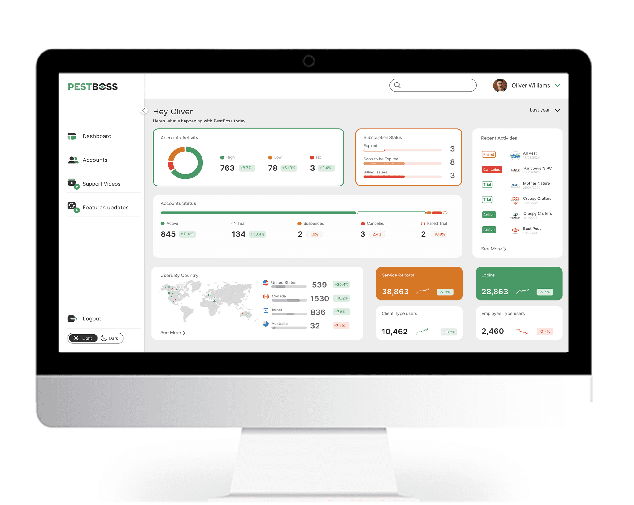
The Main Dashboard

Clear Hierarchy: Information flows logically, ensuring easy navigation.
Color Coding: Green for positive and red for negative insights enhance data comprehension.
Intuitive Navigation: Sidebar menu simplifies access to different sections.
Dark/Light Mode Toggle: Offers users a personalized viewing experience.
Geographical Insights: World map visualizes user distribution by country.


The Accounts Activity Dashboard

Layout and Structure: Clean, organized layout with a clear hierarchy.
Functionality: Account filtering options (Status, Country, Activity, Subscription status).
Data Visualization: Effective use of icons, Clear presentation of key account metrics, Status indicators use both color and text for clarity.


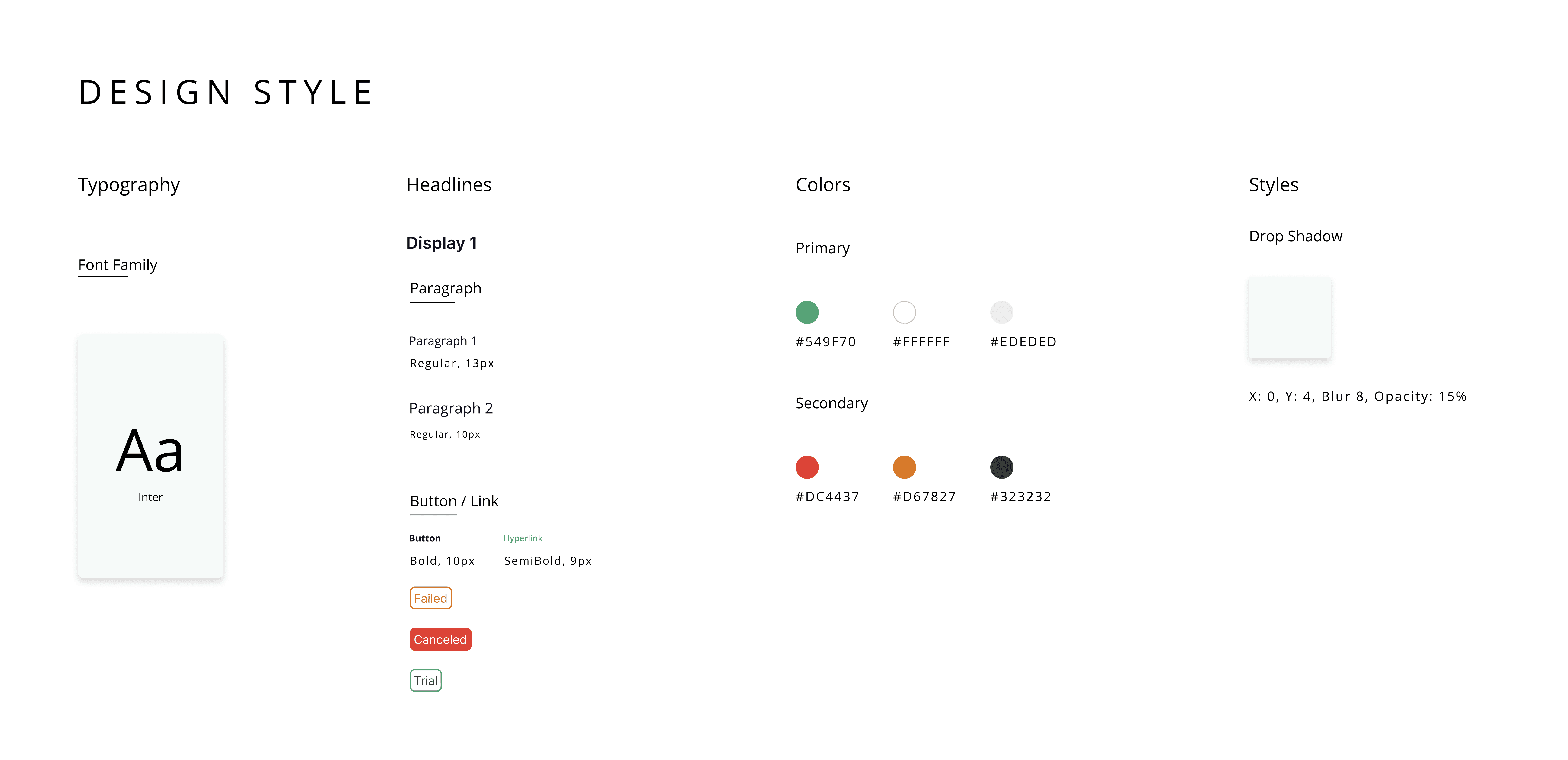
Visual and Interaction Design

User-Friendly Navigation: Easy access to main sections.

Visual Hierarchy: Clear prioritization of information.

Color Coding: Immediate understanding of statuses and actions.

Responsive Design: Ensures usability across devices.

" I invest too much precious time gathering information and monitoring account statuses. "

The solution

This redesign of the PestBoss Admin Dashboard aims to provide a powerful, user-centric tool for administrators, addressing their pain points and enhancing their ability to manage customer data effectively.
By prioritizing customizable data visibility, intuitive filtering, real-time updates, and comprehensive user categorization, this solution will significantly improve operational efficiency and decision-making for users like Oliver Williams.

The Main Dashboard

Clear Hierarchy: Information flows logically, ensuring easy navigation.
Color Coding: Green for positive and red for negative insights enhance data comprehension.
Intuitive Navigation: Sidebar menu simplifies access to different sections.
Dark/Light Mode Toggle: Offers users a personalized viewing experience.
Geographical Insights: World map visualizes user distribution by country.

.

The Main Dashboard

Clear Hierarchy: Information flows logically, ensuring easy navigation.
Color Coding: Green for positive and red for negative insights enhance data comprehension.
Intuitive Navigation: Sidebar menu simplifies access to different sections.
Dark/Light Mode Toggle: Offers users a personalized viewing experience.
Geographical Insights: World map visualizes user distribution by country.

Thank you
Visual and Interaction Design

User-Friendly Navigation: Easy access to main sections.

Visual Hierarchy: Clear prioritization of information.

Color Coding: Immediate understanding of statuses and actions.

Responsive Design: Ensures usability across devices.